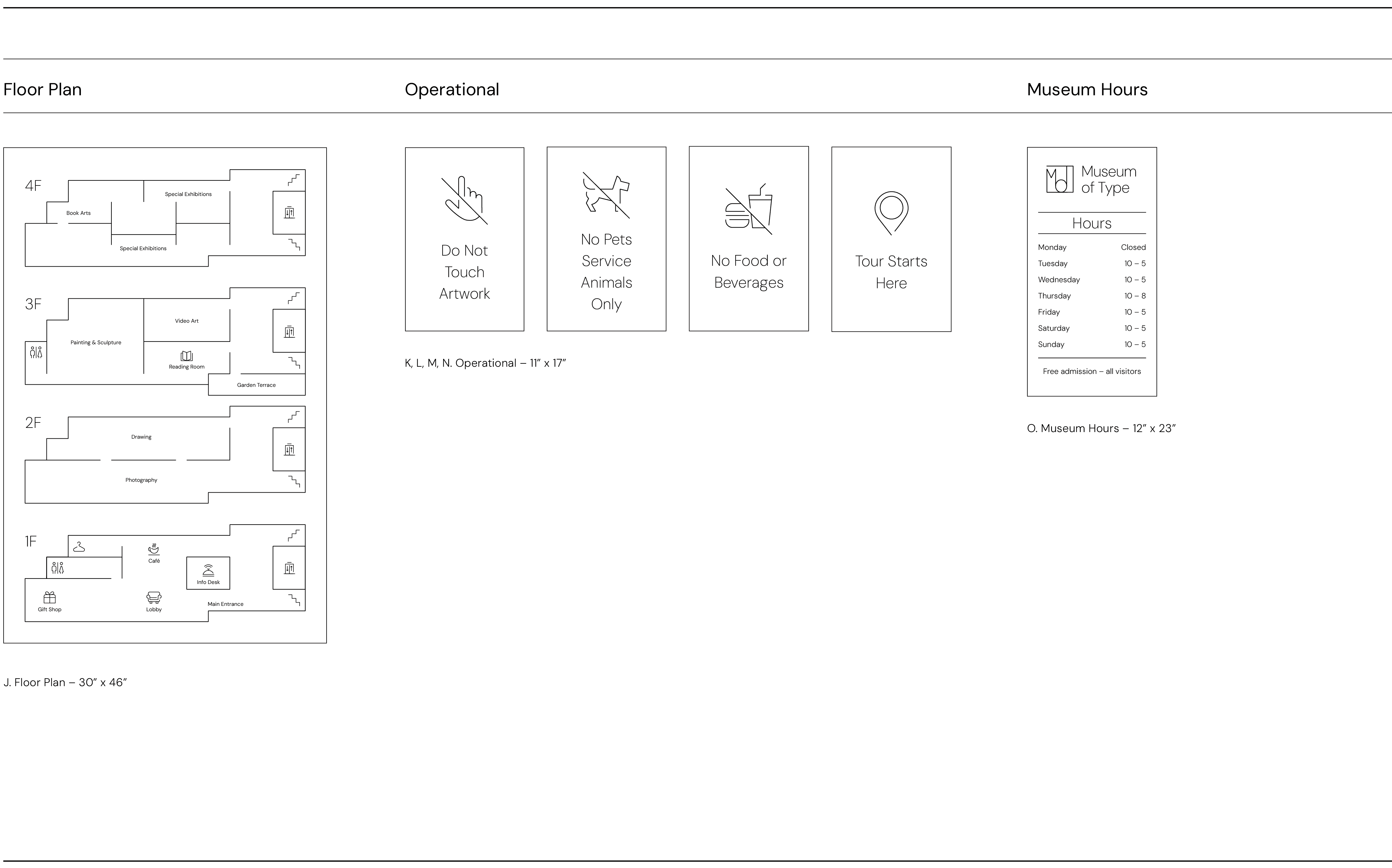
A wayfinding system designed for a museum, featuring a typography system, iconography, and environmental signage. All elements are unified through a single-stroke aesthetic with icons and directional arrows derived from characteristics of the typeface DM Sans.
Close


(01) Typography
Typeface
DM Sans was selected for its open curves, legibility, and range of weights. Its high x-height and clear proportions support a structured hierarchy and consistent vertical rhythm.

Hierarchy
Font weights, sizes, and spacing are selected to maintain optical consistency across all scales and to align visually with the stroke weights of arrows, separators, and pictograms.

(02) Iconography
Pictograms
Pictograms are designed to extend the geometric voice of DM Sans, translating its structure into forms that feel precise and soft. Icons are constructed on a flexible grid, which is not a strict template but a guiding framework that ensures visual consistency throughout the system.


Icon Scaling
Pictograms are designed to extend the geometric voice of DM Sans, translating its structure into forms that feel precise and soft. Icons are constructed on a flexible grid, which is not a strict template but a guiding framework that ensures visual consistency throughout the system.

(03) All Signagre